November 29, 2014 - January 17, 2015
Reception: December 13, 2014 4-6PM
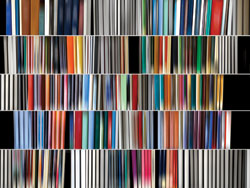
When Danae Falliers explored the extraordinary, Rem Koolhaas-designed, Seattle Public Library, she photographed the building and its endless stacks and shelves of neatly organized books. Due to the relatively low lighting conditions, all of the text along the book spines softly disappeared, and Falliers recognized that her library photographs had edged closer to pure abstraction. She decided to pursue the potential of this discovery by digitally enhancing and manipulating a group of new library images, blurring the book edges and re-assembling assorted rows of books of various colors and thicknesses. Rather than framed and captured in the mode of traditional photographic practice, these images are constructed. They are fabricated using elements of color and form in the manner of a geometric abstract painter or sculptor. Not surprisingly, Falliers acknowledges the conceptual and formal influences of three seemingly disparate artists, Gerhard Richter, Ed Ruscha and Bridget Riley, whose works she references in scraped blurs, the use of books, and the stripes of Op Art.
Concurrently, the gallery will present its fourth exhibition of the work of Dan McCleary.
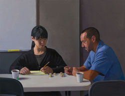
In 2009, LA Times art critic Christopher Knight observed that McCleary has “a clear-eyed sense of gravity that recalls the likes of Piero della Francesca.” His paintings usually contain two or three figures in everyday moments of Southern California life, such as sitting at a nail salon or ordering drinks at a coffee shop, but his compositional structure has the solidity and balance of fine architecture. McCleary employs classical methodologies and devices like the golden mean, as well as the traditional building blocks of design: cube, sphere, cylinder and cone. In fact, in one painting entitled Therapy, two people are considering a cluster of small cubes on a table as if, like the artist, they are contemplating the formal role these objects play in the larger composition. He always works from life, staging his models and props in his studio where they are illuminated from a single natural light source from the left, like the majority of Vermeer's paintings. McCleary also physically engages the viewer by orchestrating scenes with tables that invite one’s approach, or empty chairs that project into the foreground, a technique masterfully executed by Caravaggio in his Supper at Emmaus.

